
G324- Advanced Portfolio
A2 Media Studies
Felicity Challender
Candidate Number: 8441 Centre Number: 18503
Downham Market Academy Sixth Form
4th November- 7th November- Researching,Creating and Receiving Feedback on Record Labels
A record label is a brand or trademark that represents an artist and is associated with the promotion and marketing of the artist, their recordings/music and ultimately their music video. A record label are usually renowned for a specific genre or one or two genres in which they have top quality artists which they promote. By focusing on a specific genre or one or two genres it allows the record company a clear indication in to what artists they need and want and if they are known for a popular genre of music ultimately, have the potential to make the most money. Record labels are responsible for recording the song, mixing the song, mastering and pressing which involves the constructuon and creation of the single or album in a downloadable and CD format. There are two types of record labels: independent record labels and major labels. Independent labels are labels that have no corporate backer for funding whereas, major labels are large corporations often owned by a bigger company; a prime example of this would be Sony.


Universal records is the largest music corporation in the world and is an American based French owned multinational music corporation. Universal Music was first founded in 1934 and was previously known as Decca Records. Universal Music Group’s headquarters is currently situated in Santa Monica, California in the US; it’s believed that Universal Music is worth $6.552 billion in regards to revenue and is the host to roughly 7,000 employees. Universal Music doesn’t have a particular focus on just one genre and does in fact represent a variety of artists and bands within different genres which could link to the name and logo of the record label itself as they refer to themselves as the Universal Music Group which signifies they’re universal in regards to the music they offer as the different styles of artists they produce are able to appeal to a universal market. Universal Music Group is host to some of the most popular stars such as Emeli Sande, Lana Del Rey, Cher, Demi Lovato, Jake Bugg, Kaiser Chiefs, Rihanna, One Republic and hundreds more. In regards to the logo itself; the main central image of the logo reflects the name of the label as they have chosen to use an image of the globe to signify that they have a global appeal and have the potential artists to appeal to everyone. However, they have chosen to use a black and white palette to emphasise professionalism and have made their logo recognisable and a unique selling point yet maintained simplicity. The name of the label ‘Universal’ is then over laid on top of the world image in a capitalised bold serif font to grab the attention of the consumer and highlights the importance of the label. The fact the text is capitalised and bold means it stands out to the audience and has a greater impact on the consumer as it’s the central focus. However, the logo also has additional text in that ‘Universal Music Group’ is written underneath the logo and stands out to being different to the Universal name in that it’s smaller in size, isn’t bold and is written in a sans serif font in contrast to the serif font used prior; however, it’s still eye catching in that it’s capitalised which creates a big impact. This additional text informs the audience of the full name of the label and the repetition of the word ‘Universal’ is used to have a lasting effect on the audience so that they remember the name of the label and therefore become familiar with the label. I think the simplicity yet the USP of this logo is what makes it so recognisable to the Universal market and is definitely a prime example of a record label logo I think would be the most effective to model our own record label upon.
Island Records again is one of the biggest record labels in the world; Island Records is an American record label that operates as a division of the Universal Music Group that I looked at previously. Despite originally being founded in 1959 in Jamaica by Graeme Goodall and Leslie Kong it has been based in the United Kingdom since 1962. However, in regards to size, Island Records is one of the biggest I have researched in that as of 2014 they have split and now cover the UK, US and Australia. Similarly to their parent company Universal Music Group, Island Records represents a vast range of well-known artists which include Ariana Grande, Bombay Bicycle Club, Ben Howard, Disclosure, Florence and The Machine, Jessie J, John Newman, Leona Lewis, Mumford and Sons, Nicki Minaj, Nina Nesbitt and many more. Similarly to Universal, Island Records logo is simple yet effective and professional yet again opting to use a black and white palette. The logo shows the cut out of a palm tree silhouette out of a black circle which is recognisable and an easy link to the name itself ‘Island’. However, in contrast to its name in which you think of Islands to be small this record label is anything but with hundreds of the top selling artists all of different styles and genres. Below the logo the word ‘Island’ is written in a black thin sans serif font which is also capitalised in order to grab attention and highlight the importance of the company. The logo itself is quite bold so the contrast of thin yet capitalised font makes the two combined work well together and despite perhaps being different to the expectations of a record label logo it has become a USP for the company and the palm tree logo and the name also signifies the importance of where it originally came from- Jamaica, which is a trait they find important when representing all their artists as well.
Mercury Records is an American based record label that is owned by Universal Music Group. It operates in both the US and UK and parts of Australia. However in the US it operates through Island Records and in the UK it’s distributed by Virgin EMI Records. It was founded in 1945 by Irving Green, Berle Adams and Arthur Talmadge and originally had a big emphasis on jazz and blues, classical music, rock and roll and country music; however, since this time they have developed and expanded via their style and genres to host and represent a vast amount of different artists and bands within a variety of genres. When looking at the logo for Mercury Records it is very similar to its parent company Universal Music Group in that they have a central image of a diamond on its side with a text overlay on top. Although the diamond in the logo seen above is black in colour which is another similar element of Universal in that it uses a black and white palette there also seems to be another variation of the Mercury Records logo in which the diamond is red in colour and the word Mercury is written in white and the word Records in black. However, the logo above has both the Mercury and Records written in a white font; the word ‘Mercury’ is written in a bold swirly font in all lower case lettering whilst the ‘Records’ part is written below yet still within the diamond in a smaller font, more spaced out, sans serif font style and capitalised non swirly. However, I think this contrast makes the logo look professional and the word ‘Records’ clearly indicates the type of business they are. In addition, the Universal Music Group logo has the wording ‘Universal Music Group’ written underneath in a capitalised thin sans serif font and being a division of the Universal Company, Mercury Records has the wording ‘A Universal Music Company’ written underneath the logo in a big, bold capitalised sans serif font which looks very similar to that of its parent company which links to the idea of intertextuality and shows the audience that this record label is a creation of a bigger label and the similarity of the text style makes a clear indication as to what this record label company is and it also says the word ‘Universal’ in the wording. Being part of Mercury Records logo not only gives credit to Universal for the stars Mercury produces but could also potentially serve as an excellent form of promotion for the bigger company.

Atlantic Records is an American record label that was founded in 1947 by Ahmet Ertegun and Herb Abramson. It was initially well-known for rhythm and blues, rock and roll, jazz and hip hop artists however, in 1967 when it became wholly owned by Warner Bros, Atlantic Records also began to expand in to rock and pop music and in 2004, Atlantic Records and sibling label Elektra Records merged to become the Atlantic Records Group. From 1966 till 2005 Atlantic Records logo is the one that can be seen above to the left and was black in colouring and vastly different to their current logo which can be seen above and is simple in design and red in colour. However, when looking at their new representative logo it’s extremely simplistic in that it consists of a red circle and the wording ‘Atlantic’ is written within the circle. The writing is white in colour rather than black which makes it look less harsh and is in a capitalised bold sans serif font to grab attention and highlight the importance. It’s believed the simplicity of this logo is to enhance the importance of the record label itself and indicate that they place their importance on the purity and simplicity of their artists and don’t want a manufactured pristine image. Atlantic Records has top selling stars and artists that include Ed Sheeran, Charlie XCX, Bruno Mars, Christina Perri, FUN, Paramore and many more. The letter ‘A’ on the word Atlantic is elongated as if it’s melting or dripping and the line going across to make it in to the letter ‘A’ carries on underneath the entire word to underline the word as a whole. The red circle despite lacking detail could be said to represent a record and due to Atlantic records being well-known the reasoning behind using what may be seen as just a red circle may actually be a representation of the word records instead of writing it underneath. I personally think the simplicity of this logo is nice and effective in regards to representing a record label and I like the face they have made it different by elongating the ‘A’ and creating multiple creations by crossing the ‘A’ as well as underlining the word. I also like the fact that this is the first record label logo I have looked at that has been different and used a bright colour within their logo because despite the simplicity it’s still as eye catching as some of the other more detailed logos that are in black and white because it’s in an eye grabbing colour.
Sony Music Entertainment or commonly known as Sony Music is another American music corporation owned and operated by Sony Corporation of America which is a subsidiary of Sony Corporation which is a Japanese Conglomerate. Sony Music is middle-sized of the “Big Three” in regards to record companies with Universal Music Group at the largest and Warner Music Group. Sony Music has hosted big artists such as AC/DC, Calvin Harris, Foo Fighters, Johnny Cash and Michael Jackson when alive, One Direction, Whitney Houston and Meghan Trainor. The logo for Sony Music is simple, unique and like Atlantic Records actually uses a bright colour- red yet still maintains effectiveness, style and professionalism. Sony Music is written in a capitalised, large, bold black serif font underneath the logo to show what company the logo is representing and the logo itself is red in colour and takes the form of a curved shape that looks like a smudge or a whirlwind which could be a representation of this record label taking the world by storm. The text and the logo are grabbing and appealing to the eye as the contrast of the red logo and black writing compliments each other well and the uniqueness of the logo leaves a lasting impression on the audience. In addition to being a whirlwind the logo could also signify that they represent a vast majority of different artists to have a wider appeal to a global audience, and there is no background or outline to the logo which could signify freedom and that the company and their artists aren’t confined. The simplicity yet confusion of this logo actually allows it to have a USP within the market and makes it a recognisable logo within the music industry and around the globe which I think is a good trait to have within our record label logo if we can achieve it.
Creating Our Record Label
As part of our music video coursework, we were required to create a record label name and logo that would form as the representative name and company for our unsigned music artist- Christian Smith. Initially to start this process, we were required to think of suitable names for our record label; I took a lead role in this process in regards to my team but we worked as a team to discuss and create the finalised names.
Firstly we thought of the name 'Phonic Records' as we felt it linked nicely to the music industry in that Phonic is related to speech and sound so we can relate this to the lyrics and music of the artist. We also thought of the name 'Amity Records'; I felt this had a nice ring to it and the link behind the meaning is that Amity is known to mean friendship and peace and as a label that is representing an acoustic singer songwriter felt this emphasised the peacefullness and meaningful connections that would be able to be made via his songs. Our final recordlabel name was Lucid Records however, after I researched this online much like we did with all the other ones we thought of found this to already exist; this meant we had to brainstorm another initial ideas for a name and came to the conclusion of 'Auroral Records'; auroral refers to light and the Northern Lights which we felt this linked nicely to our music being organic and natural rather than manufactured and artifical.
We were unable to decide as to which name was the most suitable for our record label so decided to carry out a vote using a tally by going around the sixth form and asking both students and teachers (30 in total) which name they preferred. The tally results for this can be seen below.

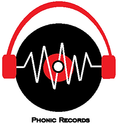
As can be seen from our tally results we has a clear winner when it came to the name of our record label- Phonic Records. Once this was decided we had to think of concepts and ideas as to what our logo was going to look like. We felt it would be best to produce a range of different variations of the same logo but to have roughly 3-4 different logos in total. For the first logo idea concept Annabelle an Kathryn came up with the idea of a record and headphones and to have the name of the label on top of the logo similar to those I analysed earlier. The finished creation for this 1st initial logo can be viewed below.

Once this initial logo was created I then thought of the different variations we could do to make the logo look slightly different and we worked as a team to produce these. Firstly I thought we could try the logo without the headphones and maintain the record and the text but make the wording of 'Records' straight rather than curved. I then thought we could keep the initial logo which included the record, the sound waves and the headphones but try putting the text Phonic Records in a capitalised font underneath which is one look a lot of labels opt for. The images for these two variations of this logo can be seen below this text.

After this me and Annabelle worked together to create additional logos to represent our record label. I thought of a good concept of using sound bars to relate to the music and myself and Annabelle worked together to create this version of the logo and alter the original to create different variations which included changing the colour and positioning and style of the text. Me and Annabelle felt these logos were simple and professional yet effective much like some of the most well known music label logos in the world. The logos created by Myself and Annabelle and the different variations can be viewed below in the form of thumbnails; please click to enlarge.
 |
|---|
 |
 |
 |
Finally, me and Annabelle went on to further create another two logos as we both agreed none of the logos yet created were organic or particularly suitable to the genre of music we had chosen. This is why we designed another two logos for our audience to choose from. My logo is the one using a guitar and to represent organic Annabelle's logo is the one using a carrot. Both of these are simple logos yet we felt were effective and represented the genre. Both of these can be seen below.


We then printed out a sheet of paper that contained all of our logos and went around the sixth form to ask the opinion of students and teachers so we asked a variety of age ranges to see which logo they preferred for our record label. By asking our audience it gave us a true indication as to what our target audience wants and eliminates bias on our part if we were to have chosen ourselves. There was a clear winner when it came to asking what logo the audience preferred but they did have an improvement for it. We found the most votes which was done as a tally alongside the image was the 1st original logo designed; however, they wished for the word 'Records' to be straight rather than curved which was within one of the variations of the logo but within the variation the headphones were also missing however, the audience found the combination of the record, sound waves and headphones gave a clear indication in to the idea of music and proved to be an effective and professional looking logo to represent a music label. Our finalised Phonic Records label logo can be viewed beneath and people's feedback in regards to this logo was that they liked the contrast of colours (black and red) and felt the image linked well to the music industry; Kathryn was responsible for editing the finalised logo which involved making the text of 'Records' straight.
